
Digital Storytelling in Action: How the NYT Reconstructed Greenwood for “The Tulsa Race Massacre of 1921”

Rachael Cristine Woody
In a recent post, we introduced visual storytelling platforms and the opportunities they create for museums. Today, we take a closer look at a compelling code-based example: The Tulsa Race Massacre of 1921, a digital exhibit by The New York Times (NYT).
Published using scrollytelling techniques and shared via GitHub, this project demonstrates how code, archival materials, and interactive design can powerfully reconstruct and convey a historic narrative. The story unfolds on a linear pathway and incorporates photographs, the town layout, and business records to reconstruct a 3D model of Tulsa’s Greenwood neighborhood.
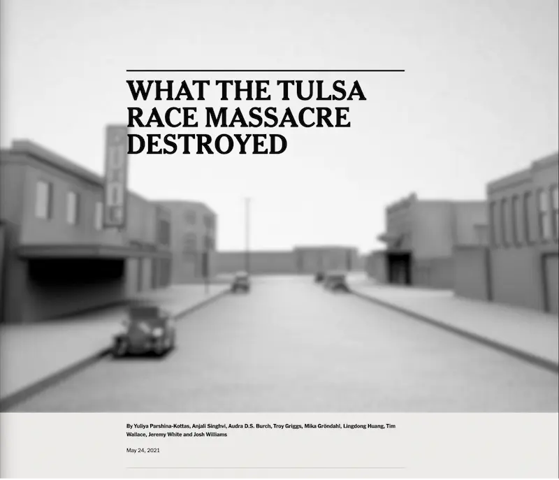
A still photo from “The Tulsa Race Massacre of 1921.” Source: The New York Times, https://www.nytimes.com/interactive/2021/05/24/us/tulsa-race-massacre.html. This image displays the landing page image for The Tulsa Race Massacre of 1921 online exhibit.
Details of NYT’s “The Tulsa Race Massacre” Exhibit
- Online Exhibit: The Tulsa Race Massacre of 1921
- Institution: The New York Times (in collaboration with cultural heritage institutions)
- Digital Publishing Platform: The New York Times
Storytelling Infrastructure
The storytelling infrastructure for this example is:
- Story Path: Linear Pathway
- Storytelling Performance Types: Written, Visual
- Sensory Setting: Color
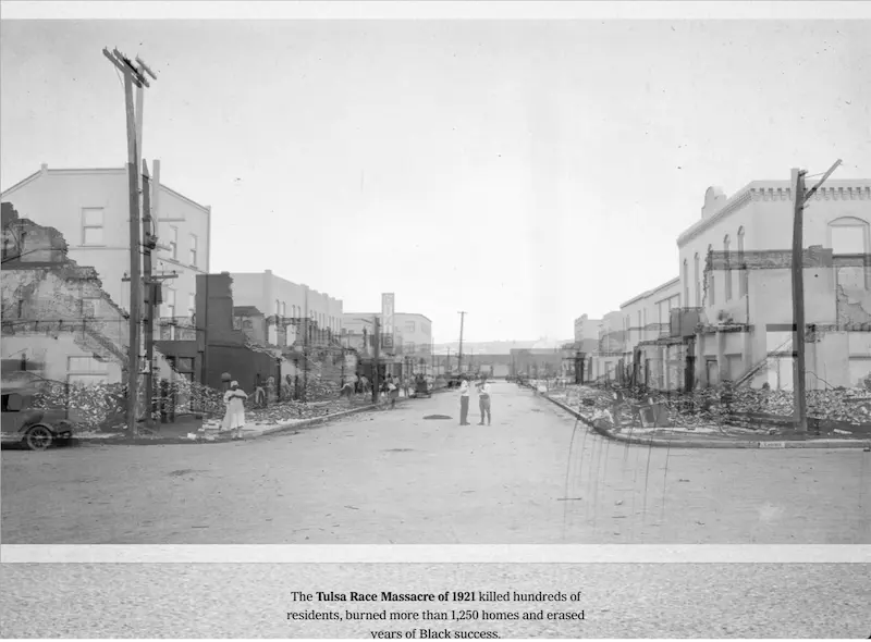
A still photo from “The Tulsa Race Massacre of 1921.” Source: The New York Times, https://www.nytimes.com/interactive/2021/05/24/us/tulsa-race-massacre.html. This image illustrates the transition from a black and white photograph of the town to an explorable town map.
Tool: Photograph Overlay to 3D Model
The photograph overlay of a destroyed town dissolves into a 3D rendering of the Greenwood neighborhood—America’s Black Wall Street. This display effect is only used once and is intentionally haunting due to the atrocities that took place. Archival photographs combined with modern-day images are an effective tool for visually conveying the profound changes that can occur over years or within seconds.

A still photo from “The Tulsa Race Massacre of 1921.” Source: The New York Times, https://www.nytimes.com/interactive/2021/05/24/us/tulsa-race-massacre.html. This image displays town buildings on either side of the street. As the visitor progresses down the street, nearby buildings will transition in color from gray-scale to yellow. Next to each yellow building is a list of Black businesses that resided there.
Tool: 3D Model with Business Information
The 3D map was created with several layers of archival materials: Sanborn Insurance and other Greenwood-area maps, business directories, and photographs were all used to inform the 3D reconstruction of Greenwood. As the scroll down progresses, you “walk” into the town and the view angles from left to right as yellow highlighted buildings list the Black businesses that resided there. Interspersed among walking the buildings is additional essay text that continues to tell the story of a prosperous Greenwood.

A still photo from “The Tulsa Race Massacre of 1921.” Source: The New York Times, https://www.nytimes.com/interactive/2021/05/24/us/tulsa-race-massacre.html. Once the visitor has explored businesses, the exhibit transitions to the people who owned those businesses. This image displays a black and white photograph of James Nails, a co-owner of Black Swan Records, a business that resided in the Gist Building. On the left of the pop-up is the photograph of Nails with a hyperlink to a catalog record from the Tulsa Historical Society and Museum. On the right of the pop-up is text that identifies the person, business, and location of the business in Tulsa.
Tool: Profiles with Additional Information and Sources
As the town tour continues, profiles are available for a few of the business residents. These profiles often contain a photograph, identification of the person or people, a hyperlink to additional resources outside of the story platform, and citations (with link) on where the resources reside. Centering the residents through story and visuals helps to facilitate the creation of empathy. The stories of individuals weaved together delivers a more powerful impact on the viewer as points of shared connection are made regarding the residents, their work, their families, and what they did for fun.
Storytelling Tool: Map with Timeline
The final display point of interest is the use of a town map with points of events on a timeline. The mob portion of the attack was on foot and moved across from white-Tulsa into the Greenwood neighborhood. Both the map and the timeline together powerfully demonstrate how time and space have run out. The result is chilling.
Replicating Powerful Storytelling: Lessons from the Greenwood Experience
This entry of digital storytelling offers several examples of display tools and concepts that deliver a profound and evocative effect. It also demonstrates the possibility of recreating moments in history using an array of archival materials.
For this story, the archival items served as deep sources of information while at the same time offering connection opportunities for empathy generation. In this instance, the linear pathway was an effective choice as it helped walk the audience through an intense and harrowing event. The narrative provided by the authors throughout the tour helped to piece the primary information together, and aided in the distillation of the audience received.
This is the NYT, so the quality of this story is no surprise. However, it does not take knowledge of code or access to NYT journalists to tell a powerful story. The story execution and display concepts offered in all the examples in this chapter can be replicated, even in simplistic forms. I encourage you to experiment with different story structures, story layouts, and display tools to find the best fit for both the story and the storyteller.
Seeking a high-tech museum CMS that allows you to offer engaging storytelling audio-visual experiences and share more information with online visitors? Get in touch to learn more about Argus!
Rachael Cristine Woody
Rachael Woody advises on museum strategies, digital museums, collections management, and grant writing for a wide variety of clients. She has authored several titles published by Lucidea Press, including her latest: The Discovery Game Changer: Museum Collections Data Enhancement. Rachael is a regular contributor to the Think Clearly blog and presents popular webinar series covering topics of importance to museum professionals.
**Disclaimer: Any in-line promotional text does not imply Lucidea product endorsement by the author of this post.
Never miss another post. Subscribe today!
Similar Posts

Shared Resilience: Museum and Affinity Group Partnerships
Successful museum-affinity group partnerships are based on turning cultural capital into community capital, offering multiple benefits for the group and the broader community, all thriving within the museum ecosystem.
Culture on Tap: The Power of Commercial-Cultural Partnerships
When cultural heritage aligns intentionally with local business goals, it unlocks a powerful value exchange that transforms heritage into an economic engine, aligning historical narratives with local commerce.
Civic Catalysts: How Museums and Local Governments Build Resilient Communities
Building alliances with local government shifts museums from the margins of community planning directly into the center of civic life. Detailed analysis of how the resulting ecosystem fortifies museum operations.

Joint Ventures in Museopreneurship: 3 Collaborative Models
The future of museum sustainability belongs to institutions that lean into collaboration rather than isolation, through shared art acquisitions, innovative brand franchising, or membership networks, amplifying impact while mitigating risk.
Leave a Comment
Comments are reviewed and must adhere to our comments policy.
0 Comments