KM Component 28 – User Interface

Stan Garfield
The user interface is the point of entry to a knowledge management system that provides navigation, search, communication, help, news, site index, site map, and links to all tools.
To make it easy for users to access the people, process, and technology components offered by your KM program, provide an intranet or portal site with obvious links to the available resources. Allow users to quickly navigate to the appropriate sites based on their role, business process stage, and current requirements.
The principles of good usability should be incorporated into the user interface. Specific advice for doing so is provided in Ensure KM Adoption by Offering a Great User Experience. Here are additional suggestions.
Offer the following categories for navigation:
- Internal organizational structure – e.g., Finance, Human Resources
- Formal taxonomy: industry or internal – e.g., Global Industry Classification Standard, enterprise taxonomy
- Products and Services – e.g., Android, Strategy Consulting
- Topics – e.g., security, supply chain management
- Industries – e.g., electronics, pharmaceuticals
- Clients – e.g., GE, US Government
- Partners – e.g., Ford, Microsoft
- Locations – e.g., Latin America, Detroit
- Specialties and Roles – e.g., project management, information architect
- Demographics – e.g., new hires, retirees
Provide the following user interfaces:
- Navigation
- Search
- Facets
- Related (since you downloaded X, try Y)
- A-Z Index
- Tags
- Bookmarks
- Sorted by:
-
- Most visited or downloaded
- Most liked
- Most reused – add a “I reused this document” or “I found this useful” button, similar to a “Like” button, but more specific, to all content, and encourage users to click on this button for content they were able to reuse
- Most tagged – allow content to be tagged with “recommended” or “good example” or “proven practice”
- Most recent
Give users flexible ways to use systems, including:
- Mobile – optimize for mobile devices
- Voice – accept voice commands and offer results by audio
- Accessibility – enable people with disabilities to perceive, understand, navigate, interact with, and contribute to websites
These related fields help provide a good user interface:
- Information architecture: the structural design of shared information environments; a discipline and a set of methods that aim to identify and organize information in a purposeful and service-oriented way; the resulting document or documents that define the facets of a given information domain
- Usability: making products and systems easier to use, and matching them more closely to user needs and requirements
- User experience: a person’s perceptions and responses that result from the use or anticipated use of a product, system or service
Case Study
Here are user interface examples taken from my time leading knowledge management at Hewlett-Packard.
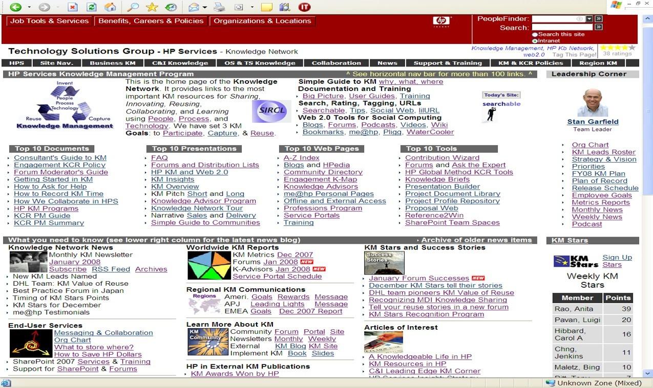
- Intranet Home Page – The HP Knowledge Network was initially offered as an intranet page, with numerous links organized into multiple sections. It was very thorough, but very dense:
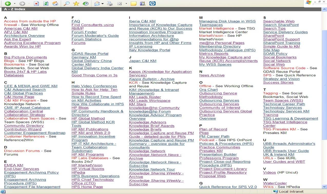
- A-Z Index – An alternative form of navigation provided the same links, in alphabetical order and with multiple synonyms:
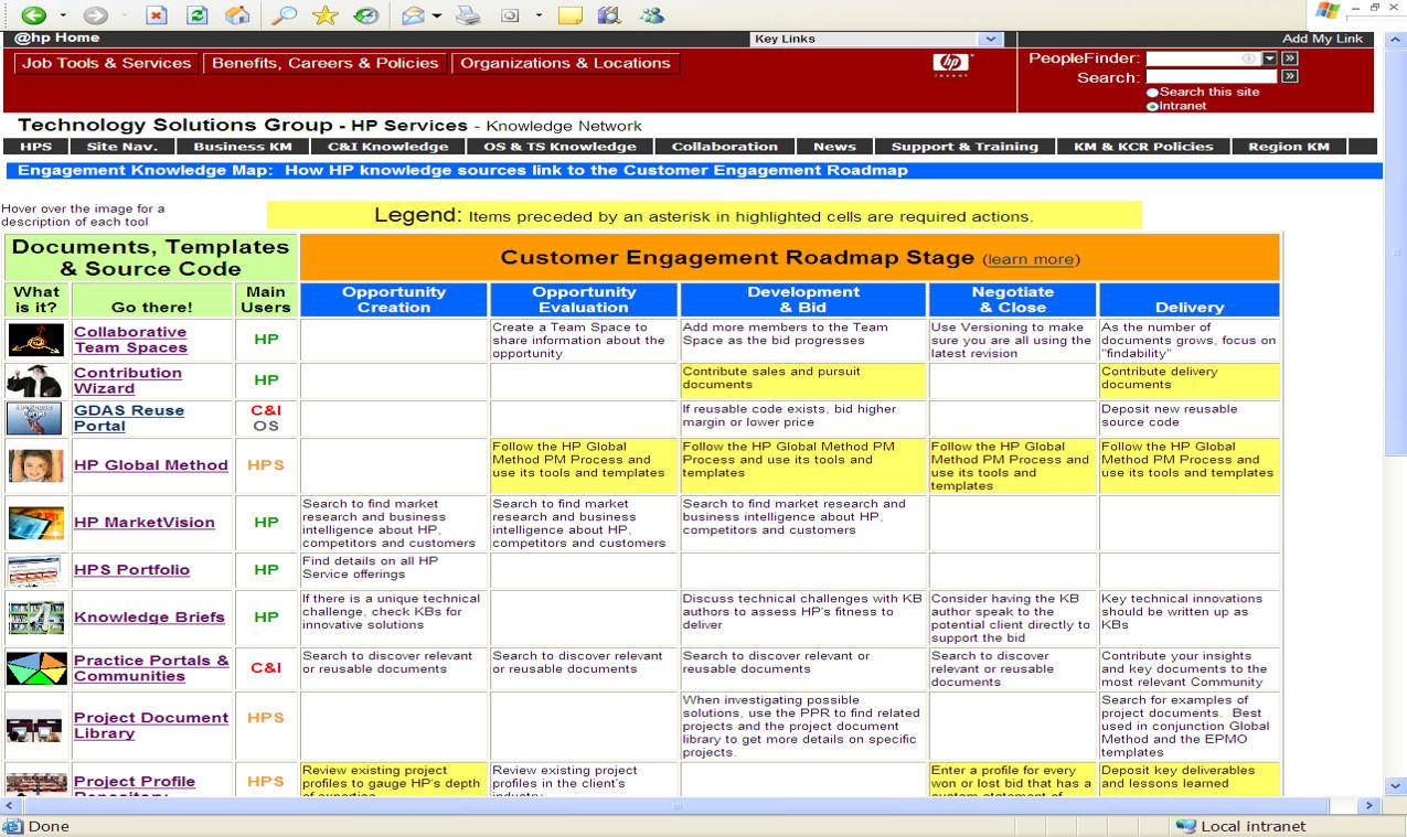
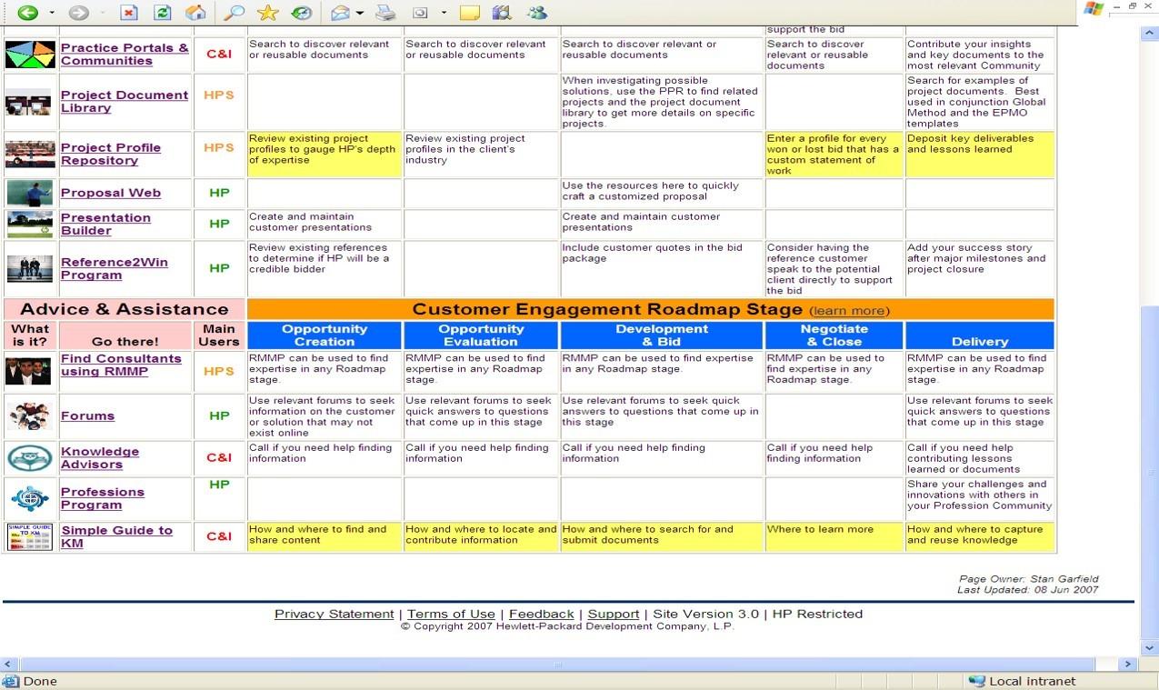
- Engagement Knowledge Map – When some users complained that the intranet page and the index did not provide the context for when and why the different resources should be used, a third site was created that embedded the links into the stages of the HP Customer Engagement Roadmap:
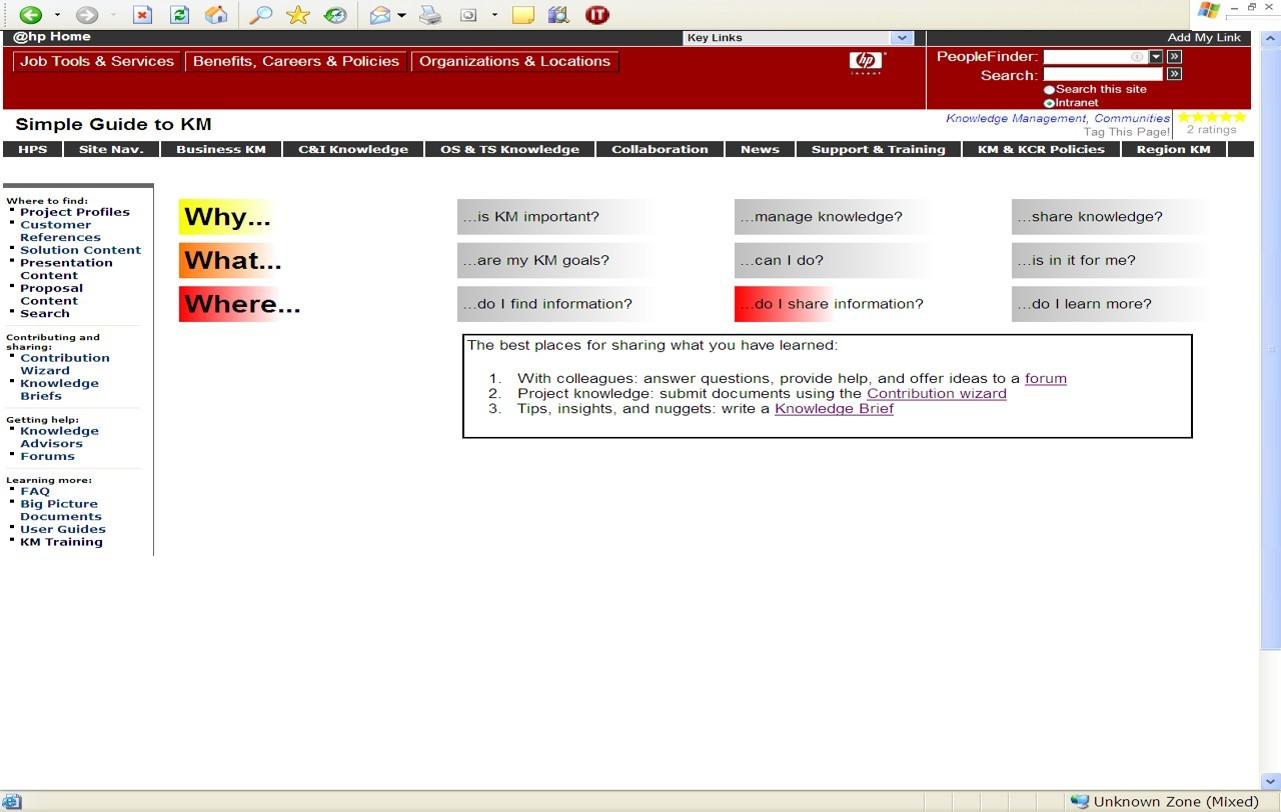
- Simple Guide to KM: When the Engagement Knowledge Map was still thought to be too complicated, a simpler user interface was created in which the answers to 9 questions were only revealed one at a time based on moving the cursor over a single question:
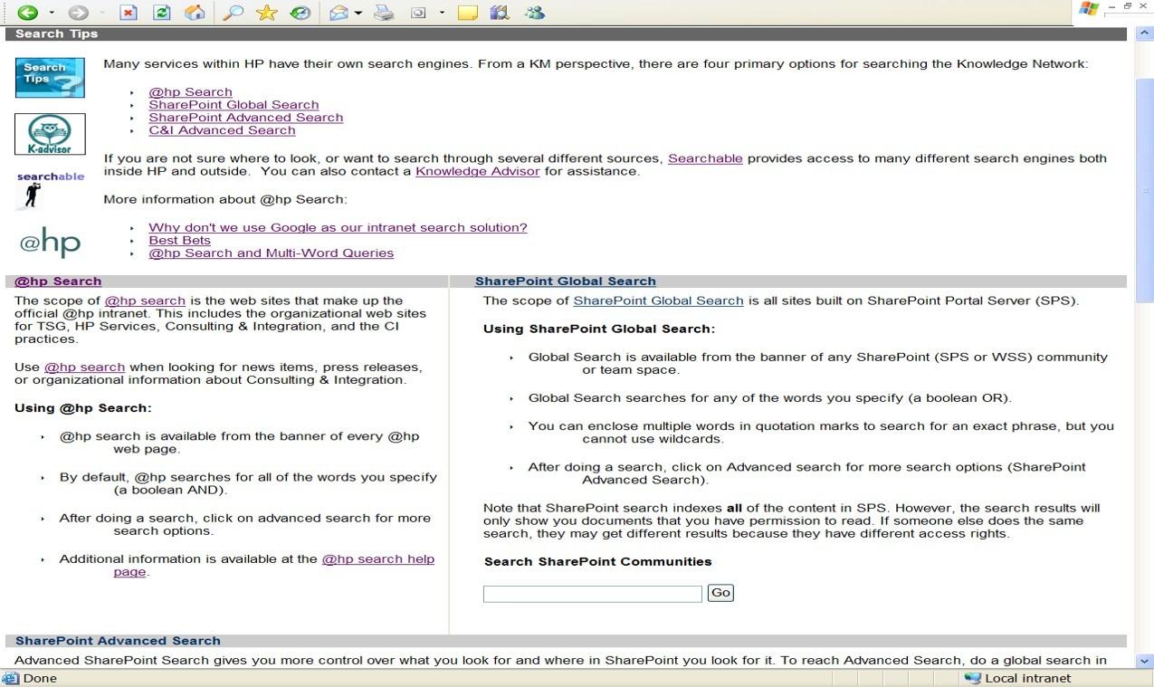
- Search Tips – To respond to the common complaint that search didn’t work, or was too hard to use, a page of tips was offered:
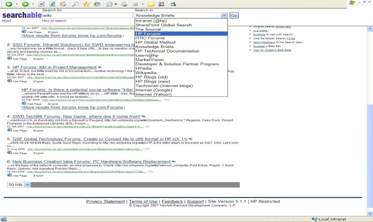
- Integrated Search – To avoid forcing users to have to try searches multiple times using different search engines for different repositories, an integrated search page was created, allowing a single query to be automatically replicated with no additional effort:

Stan Garfield
Please enjoy Stan’s additional blog posts offering advice and insights drawn from many years as a KM practitioner. You may also want to download a copy of his book, Proven Practices for Implementing a Knowledge Management Program, from Lucidea Press. And learn about Lucidea’s Inmagic Presto and SydneyEnterprise with KM capabilities to support successful knowledge curation and sharing.
Similar Posts
Lucidea’s Lens: Knowledge Management Thought Leaders Part 98 – Rachad Najjar
Generative AI, expertise mapping, and knowledge sharing—Rachad Najjar has spent his career at the intersection of these disciplines. As the CEO of 3R Knowledge Services and former knowledge-sharing leader at GE Vernova, he has helped many organizations design smarter KM strategies. In this edition of Lucidea’s Lens, Stan Garfield highlights Rachad’s contributions to the field.
Lucidea’s Lens: Knowledge Management Thought Leaders Part 97 – Art Murray
As CEO of Applied Knowledge Sciences and Chief Fellow of the Enterprise of the Future Program, Art Murray champions innovative approaches to knowledge curation, digital transformation, and governance. Discover Art’s work and impact on knowledge management and organizational transformation.
Lucidea’s Lens: Knowledge Management Thought Leaders Part 96 – Peter Morville
Peter Morville is a pioneer in the fields of information architecture and user experience, with expertise in organizational strategy and planning. His specialties include findability, information architecture, user experience, usability, and systems thinking.
Lucidea’s Lens: Knowledge Management Thought Leaders Part 95 – Matt Moore
Matt Moore is a project/program manager, blogger, presenter, webinar host, and deep thinker. He has worked in the knowledge management field for over 20 years.


Leave a Comment
Comments are reviewed and must adhere to our comments policy.
0 Comments