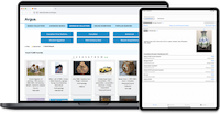
Museum Collections Online with Accessibility Principle 2: Operable

Rachael Cristine Woody
This week will continue our review of the World Wide Web Consortium (W3C®) technical standards set forth in the Web Content Accessibility Guidelines (WCAG) Version 2.1, Level AA.
Using the guidance and success criteria outlined by the WCAG, we will explore how “Principle 2: Operable” can be applied to museum collections online as facilitated by the museum Collections Management System (CMS). As the DOJ has selected WCAG Version 2.1, Level AA as the public services standard, this series will use that version as a guidepost for discussing how to improve accessibility for museum collections online.
For more information on the WCAG and its application to collections online, please see our previous posts on Lucidea’s Think Clearly Blog: Museum Collections Online with Accessibility Principle 1: Perceivable, and Accessibility Standards for Museum Collections Online.
Principle 2: Operable
This principle offers guidance on how to support the operation—navigation, engagement, and use—of the museum collections content online as published by the CMS.
Keyboard Accessible: Functionality and the ability to navigate to and from components of the museum collections online must be available through use of non-modified keyboard input.
- Keyboard: Navigation through collections online can support keyboard input for navigation directions. Any functionality such as selection of object records, selecting digital assets to play or enlarge, and any search selection and functionality must also be available using a keyboard.
- No Keyboard Trap: When using a keyboard to move to an element of the collections online interface, it must also be possible to navigate away from, close, or exit that element also using a keyboard.
- Character Key Shortcuts: If the collections online interface allows a keyboard shortcut, then it must be possible to either turn it off, remap it to a keyboard input, or is only active when the component is the element of focus.
Enough Time: While it isn’t common for museum collections online to have a timeout feature specific to their public portal, it should be verified.
- Timing Adjustable: If there is any sort of time limit related to searching and viewing collections online, then it must be possible for the user to turn the time limit off, adjust it, or extend it.
- Pause, Stop, Hide: For any moving visual assets as part of the museum content online with an auto-play feature, there should be a mechanism available to the user to pause or stop it.
Seizures and Physical Reactions: This guideline is to help safeguard against inducing seizures or other harmful physical reactions. While it isn’t common for museum content to possess such material, it should be carefully reviewed and considered—especially for any visual-moving assets presented within the CMS.
- Three Flashes or Below Threshold: This restriction should be considered if any digital assets possess a flash feature where more than 3 flashes occur in one second.
Navigable: This area includes navigation of the CMS-presented content, descriptions, and object information; as well as navigation of the collections online and the interaction with attached digital assets.
- Bypass Blocks: If the collections online portal contains repetitive information, such as how to request materials, or museum information in the footer of webpages, then the platform should also offer a mechanism to bypass those repeated areas of content.
- Page Titled: Each area of the website (often delineated as webpages) should be clearly titled with a label that makes the topic or purpose of the page obvious. For collections online content this is at a minimum the: landing (welcome) page, basic search page, advanced search page, browse page, requests page, and any digital exhibit (or gallery) pages.
- Focus Order: For collection online pages that must be navigated in a certain order, there must be an ability to focus on each component in the correct order. Web pages that are likely candidates for this are the results pages where hierarchical faceted searching is present, and in the display of an object record where meaning is conveyed by each field name.
- Link Purpose (In Context): Any links presented within the collections content must be obvious by the linked text. In collections online, the most often linked items are to Rights and Reproduction Statements and related objects. In each area the link must convey textual the context of where it is intended to lead the user.
- Multiple Ways: For all main areas of the collections online there should be multiple pathways present for how to navigate there. Object records display as the result of a specific set of steps, and fall into an area of exception.
- Headings and Labels: As with webpage titles, any headings or labels used in the collections online area must have obvious and self-descriptive names. Advanced search areas, digital exhibits, and any sections of the object record should be reviewed.
- Focus Visible: Where keyboard operation is available within the collections online, there must be a focus indicator.
Input Modalities: This is a navigation and engagement consideration as we evaluate the collections online. While “point and click” tends to be a default for CMS functionality, it’s important to ensure that other inputs are available beyond keyboard and mouse.
- Pointer Gestures: Most collections online navigation and functionality are dictated by “point and click;” however, it’s important to review if there are any gesture-only functionality without a tap or click alternative.
- Pointer Cancellation: Completion of the action isn’t predicated on the down-event of a pointer, and can be canceled or reversed.
- Label in Name: Any labels used in the presentation of collections online must be text readable. If there is an image of text, there must be an accessible name to go with it.
- Motion Actuation: Functionality that supports user motion must also support a non-motion interface and motion can be disabled.
Conclusion
Ensuring that your collections online are fully operable is a huge priority for usability. This is an excellent example of where improved accessibility improves usability for everyone. Please tune in next week as we conclude our series with coverage of the last two principles: Understandable and Robust.
Notice
Copyright of the World Wide Web Consortium (W3C®). This document includes materials copied or derived the Web Accessibility Initiative (WAI) website. Specific resources are credited below, in accordance with the W3C’s Using WAI Material: Permission to Use with Attribution policy and specifications for a W3C Document License.
Citation 1: Web Content Accessibility Guidelines (WCAG) 2.1. W3C Recommendation 21 September 2023. Editors: Andrew Kirkpatrick (Adobe), Joshue O Connor (Invited Expert, InterAccess), Alastair Campbell (Nomensa), and Michael Cooper (W3C). Copyright © 2020-2023 World Wide Web Consortium. W3C® liability, trademark, and document use rules apply.
Citation 2: Introduction to Understanding WCAG (Version 2.1). Updated 20 June 2023. Developed by Accessibility Guidelines Working Group (AG WG) Participants (Co-Chairs: Alastair Campbell, Charles Adams, Rachael Bradley Montgomery. W3C Staff Contact: Michael Cooper). Copyright © 2023 World Wide Web Consortium. W3C® liability, trademark, and document use rules apply.
The content was developed as part of the WAI-Core projects funded by U.S. Federal funds. The user interface was designed by the Education and Outreach Working Group (EOWG) with contributions from Shadi Abou-Zahra, Steve Lee, and Shawn Lawton Henry as part of the WAI-Guide project, co-funded by the European Commission.
Citation 3: How to Meet WCAG (Quick Reference). Updated 12 Nov 2023. Version 3.5.1. Lead Developer: Eric Eggert (W3C). Project Lead: Shadi Abou-Zahra (W3C). Previous editors and developers: Gregg Vanderheiden, Loretta Guarino Reid, Ben Caldwell, Shawn Lawton Henry, Gez Lemon. Copyright © 2023 W3C® (MIT, ERCIM, Keio, Beihang) Usage policies apply.
The 2023 redesign was developed by the Education and Outreach Working Group (EOWG) and the Web Content Accessibility Guidelines Working Group (WCAG WG), with support from the WAI-DEV project, a project of the European Commission IST Programme.

Rachael Cristine Woody
To learn more, please join us for the companion webinar Accessibility Standards for Museum Collections Online, Wednesday, July 31 at 11 a.m. Pacific, 2 p.m. Eastern. (Can’t make it? Register anyway and we will send you a link to the recording and slides afterwards). Register now.
**Disclaimer: Any in-line promotional text does not imply Lucidea product endorsement by the author of this post.
Never miss another post. Subscribe today!
Similar Posts
A Collaborative Museum Discovery Portal: Blending Best Practices
By blending best practices, partnering museums can improve collections access and deliver consistent results across a shared discovery portal.
Updated and Ready to Read: Grants Workbook & Templates, 2nd Edition
Lucidea is excited to release the second edition of Rachael Woody’s “Grants Workbook & Templates” for libraries, archives, and museums—updated for 2026.
The Partnership Blueprint for a Collaborative Museum Discovery Portal
Learn how shared collection discovery portals help museums connect collections across institutions and improve access through collaborative data practices.
Power in Partnerships: The Discovery Portal
Discovery portals allow partnering museums and consortia to expand collection visibility and collaborate across institutions without changes to internal CMS workflows.


Leave a Comment
Comments are reviewed and must adhere to our comments policy.
0 Comments